


While we like to show off great websites that we’ve created, I often have to wade through the internets shady back alley of design in the name of research. So, I thought maybe I should share some gems that epitomize what NOT to do. Run, no, Run Screaming, if someone tries to sell you on a site with design like this.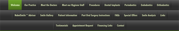
I stumbled upon this site while checking out a clients competitors. I always like to know what we’re up against. In this case, I spent several minutes exploring this site, for the same reason people have ugly sweater parties. The picture above is the navigation bar at the top of the site:
Let’s break this puppy down.
- First off, there are a lot of menu options, so much that it takes 3 rows to fit it all. I’m already confused, and I haven’t even read them yet.
- It gets worse! Yes, these are actually drop downs, under many of the headings, there are additional options! This must be the most complicated dental practice ever!
- Argh!, it gets even worse! Unbelievably, several of the drop down menu items have a sub-menu. That’s 3 levels of menu, on top of the already excessive 3 rows!
So, what’s wrong with having a comprehensive menu?
- If you think your visitors are going to go through 50+ pages, I’ve got a bridge to sell you…
- I’m not even sure what “Endodontics” is, let alone if I need something that’s encompassed in the sub menus.
- Confusing your customers is never a good business model (unless you’re a magician)
- Your menu is a powerful conversion tool, this one doesn’t give me a clear call to action.
This practice would almost be better off with a website that said “Have teeth? Call us!”, as it’s only content. All joking aside, I can’t imagine who would click “contact” based on the website. That represents a real, tangible, loss of sales dollars for this business.