Viral, just uttering the word makes online marketers start to salivate and also panic. You never know what will reach critical mass and go viral. Some pieces of content that have lain dormant, getting a few hits here and there, suddenly explode, generating thousands or even millions of hits almost overnight. Having a piece of content go viral can be great for business, but it can also be a disaster if you server isn’t able to handle the load.
Picture this:
Your website is hosted by a discount company such as GoDaddy. This is fine when 1000 people a day are visiting. Then, without any warning, someone links to an especially cute cat photo on your site from Reddit. Suddenly 10,000 people are trying to access your site at once. The virtual server, which has a limited amount of processing resources available, struggles mightily under the onslaught of traffic. The site load times slow to a crawl, if people can get through at all. Not a great first impression for thousands of potential customers.
When the Google Bot comes crawling:
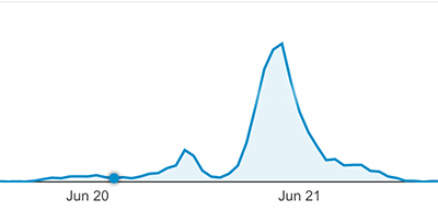
Fathers day weekend one of our clients posted a blog. The image was picked up by Google Image search and the page ranked very high for a variety of web searches related to fathers day. As the traffic graph shows, there was a massive spike in traffic, with 2 months worth coming in over 2 days!
Over the course of about 10 hours, Google showed the image to 600,000 searchers, and the page to approximately 1.4 million. That’s 2 million searchers, with the bulk of the traffic concentrated in the middle 6 hours.
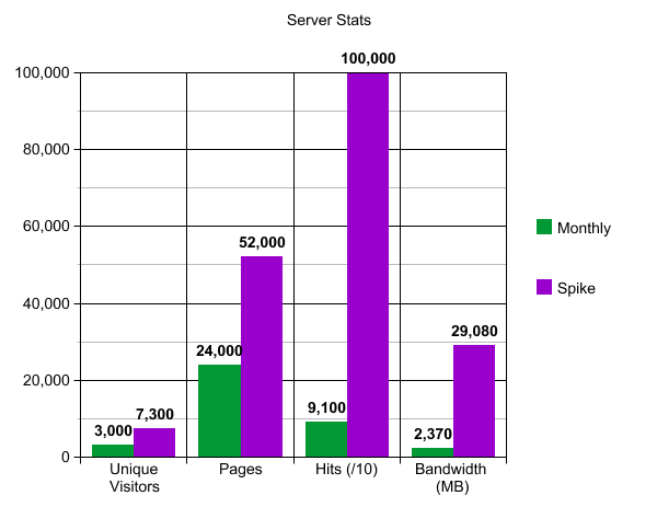
Here’s what it looks like to your server:
The green bars on the graph represent the last MONTH’s worth of traffic. While the purple bars depict the 6 hour spike. The hit count exceeded 1 million, so I had to reduce it to fit it on the graph.
You can see that we had about 2x the number of average monthly visitors during the spike, and double the monthly pages viewed as well. The real fun was behind the scenes. Google hit (requested data from) our server over 1 million times, slurping up what would have been a year’s worth of bandwidth in a couple of hours!
So, how did our server handle it? No issues at all. We’re ready for your viral blog post.
Our client, FundAmerica, was in need of a complete website redesign and rebuild. We rethought their content into a great new visual design that clearly and effectively expresses the complex financial technology services they provide.
We launched the new website on November 20, 2014. Six months later, things are going incredibly well.
Baseline
Analytics from the old site are not available, so we used the first 30 days of the new site’s life as the baseline.
Traffic Results
If you need a refresher on Google Analytics check out this blog.
Sessions were up 400%
Total New Users jumped an incredible 800%
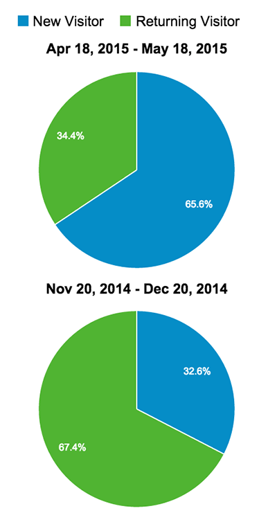
New User %: 66% vs 33% (see graph on right)
Organic Traffic share – up 1220% (to 49% share)!
Analysis: Overall traffic more than quadrupled. New users dominated, which is exactly what you want to see with an SEO campaign. Direct traffic (typing in or clicking a bookmark) more than doubled and Search traffic increased dramatically, rising to almost half of all visitors.
Bottom Line: Google thinks the new site is worth putting high in search results, and users are validating that choice by clicking through. We call this a huge success, and can’t wait to see the progress at one year.
If you are not using analytics, it’s like driving with a blindfold on. Even if you don’t crash, you will never know if you have been driving in circles or reached your destination. In this guide you will learn how to use Google Analytics to see how many people are coming to your site, where they came from and what they are looking at. Armed with this information, you will be able to create the content that gets and converts more visitors!
Analytics Dashboard
When you log in to your account you are greeted with an array of menu options, graphs, and stats. Let’s go through these one by one to get familiar with some of the terms.
Sessions – Each time a visitor comes to your site it’s a session.
Users – This is how many unique visitors look at your site.
Pageviews – Each and every page that is seen by a visitor is counted here.
Pages / Session – This is the average # of pages that each visitor views.
Avg. Session Duration – An average of how long a visitor spends at your site.
Bounce Rate – This is how many people left without visiting more than one page.
% New Sessions – This is an estimate of what percentage of users have never been to the site before (in your reporting period).
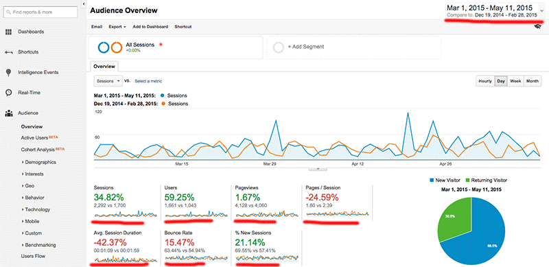
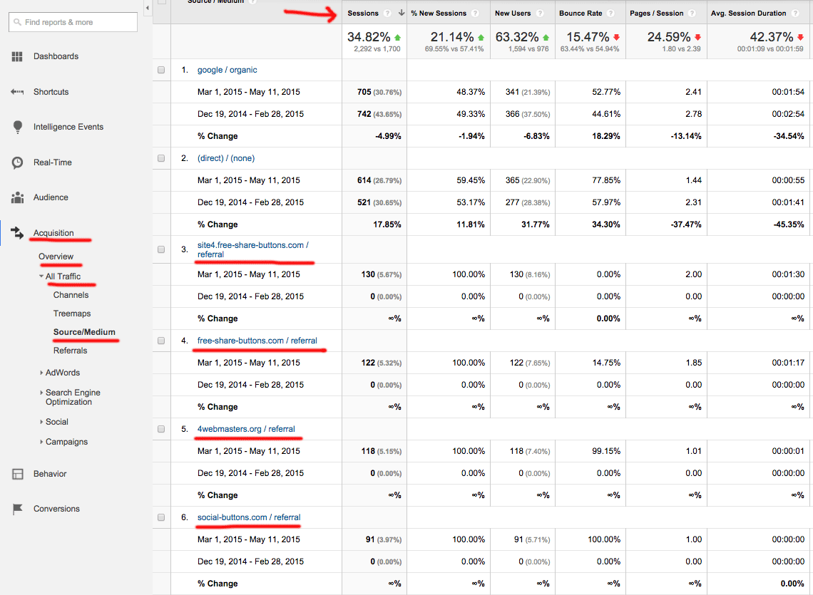
In the following example I set the date range to a previous period for comparison. Now all our stats show the percent of gain or loss. Google even colors them red and green to let you know if it’s a good or bad change.
Interpreting the data
In the example above, you can see that sessions went up 34% and users went up a whopping 59%. That’s fantastic! On the other side, even though we had 60% more users, the total number of pages served was almost identical. That drags down the pages / session to -24%. Also, the average duration is way down and the bounce rate is up. The new sessions statistic is up, but not as much as new users.
What does this mean? The data is a bit confusing. Normally, if you have an increase in visitors, you would get an equivalent percentage increase of page views, while pages/session, average duration, and bounce rate wouldn’t change by more than a few percentage points. Obviously, we need more information to figure out what happened. Did we do something that could explain this? Possibilities include:
Running paid ads – If an ad campaign brings in users, but they don’t stay, that could explain the data.
Social media – Was there some major buzz on social media that brought in casual visitors?
Website changes – Did we make a major change lately?
Spam bots – To me this looks like it could be a bad case of spam bots.
Spam bots are the plague of the internet, polluting your comments, and in this case, your analytics, all in the hope of getting you go to their website where they can try to sell you something, or infect your computer with a virus.
Fortunately, there’s an easy way to find out where these new visitors came from. Follow the navigation links to the “Source/Medium” page: Acquisition > Overview > All Traffic > Source/Medium
Checking the source
This page breaks out our visitors, using the same familiar stats, based on where they came from. They are then sorted in rank according to the number of sessions. Let’s have a look:
1. google / organic – These visitors came from a google search, probably your most important source.
2. (direct) / (none) – These visitors either have your site bookmarked, typed it in directly, or the site they came from didn’t provide a referral header.
3. site4.free-share-buttons.com – Hmm, just looking at the name makes me suspicious that this is a spam bot. Look at the stats: 130 visitors, all new, with a 0% bounce rate, they visited exactly 2 pages each. This is NOT human behavior!
4. free-share-buttons.com – This name seems familiar doesn’t it?
5. 4webmasters.org – 118 visitors with an average duration of 1 second, definitely a spam bot.
6. social-buttons.com – Another spam bot with a duration of 0 seconds.
The list goes even further, but you get the point. If we add up all the spam bots we get the answer to our confusing data – over 500 new visits from spam bots! Our human traffic didn’t change that much.
This page isn’t just useful for weeding out the spam bots, we can also see how many people came to us through Facebook, Yelp, and other sites that have links pointing to us. When you put some new content around the web, check to see which platforms are sending the most traffic! If you’re having trouble with spam check out this article to get rid of it.
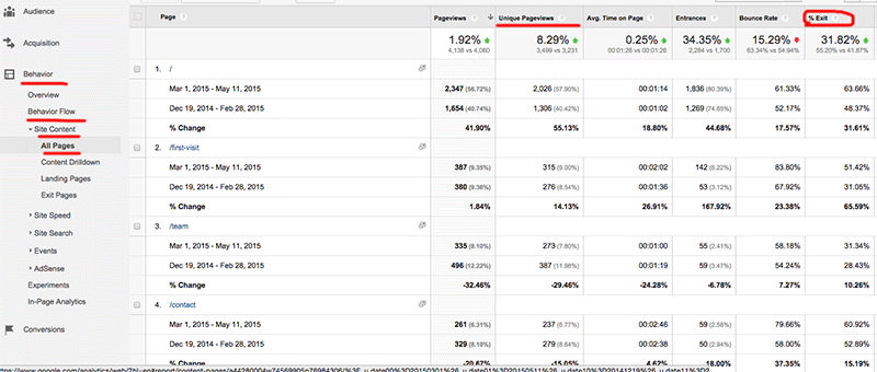
Now that we know how many visitors have come, and where they are coming from, let’s check out what they’re looking at. Behavior > Behavior Flow > Site Content > All Pages
Page level analysis
This view introduces a couple of variations on our familiar stats.
Unique Pageviews – This only counts once no matter how many times someone visits the same page.
% Exit – This is how many people left the website after visiting that page.
Bounce rate – This is a little different on this page. It’s measuring the % of people who left after landing on that page. ie. they came directly to that page, then left without visiting any other pages.
From this chart we can see that after the home page, represented as “/”, the page called “first-visit” is the most popular. Furthermore, 50% of the people that end up on this page leave the website. If you find a disproportionate percentage of people are leaving your site from a page, it may need some tweaking. If people are coming to a page, but then leaving after only a short time, the content may not be meeting their expectations.
Another excellent use of this tool is gauging how much traffic blogs receive. You don’t want to spend time writing blogs that no one wants to read. When readers find an article interesting, they will stay on the page longer, and share it with others. Looking at which blogs have the most views and longest duration, you can begin to develop a profile of what your customers find valuable. Do they like topics that are entertaining, informative, educational, artistic or a variety? Now you know, and can become their “go-to” site.
So how do I use this to make my business better?
Let’s review the top ways you can use Google Analytics to improve your content, increase your traffic, and convert more visitors.
Check your traffic stats to see if you’re winning the attention war.
Filter out spam bot traffic, and check how many actual people are coming from ad campaigns, social media, and email newsletters.
See what content is most popular.
What are your favorite stats from Google Analytics? Please post in the comments!


 Picture this: