Bad Design 2: The Homepage

Imagine I invite you to my house, we barely know each other. You come over, ring the doorbell, and I open the door. Standing just beyond the swing of the door, is my wife, children, dog, neighborhood cat, and a pile of stuff that you can’t readily identify. I say “hey, come on in”, and you take 1 step into the house, being unable to go farther because everyone is blocking the way.
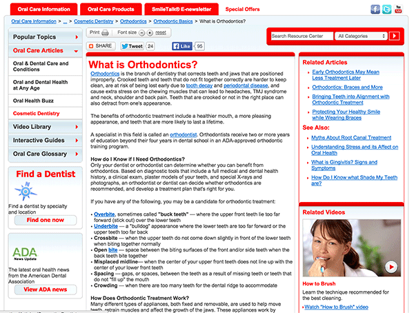
ClutterNow that you’ve “come in” I start introducing you to everyone and everything, telling you fluffy’s life story, and how bobby the neighbor boy just broke his arm at the local playground. At this point, you might be feeling a little bit awkward, and saying to yourself “why am I here”, and “when can I leave”.

Does that sound like a fun experience? Then why would you want to treat guests to your homepage the same way? A good homepage is welcoming, clearly identifies why they’ve come, and invites them in to explore.

An ugly, cluttered, confusing home page will cause users to flee, reflected in a high bounce rate. The best way to reduce your bounce rate is to implement a clean and clear design that speaks to your target audience and makes it easy for them to find what they want.


Bad Design 1: Navigation Bar

While we like to show off great websites that we’ve created, I often have to wade through the internets shady back alley of design in the name of research. So, I thought maybe I should share some gems that epitomize what NOT to do. Run, no, Run Screaming, if someone tries to sell you on a site with design like this.Menu Bar


I stumbled upon this site while checking out a clients competitors. I always like to know what we’re up against. In this case, I spent several minutes exploring this site, for the same reason people have ugly sweater parties. The picture above is the navigation bar at the top of the site:

Let’s break this puppy down.

  • First off, there are a lot of menu options, so much that it takes 3 rows to fit it all. I’m already confused, and I haven’t even read them yet.
  • It gets worse! Yes, these are actually drop downs, under many of the headings, there are additional options! This must be the most complicated dental practice ever!
  • Argh!, it gets even worse! Unbelievably, several of the drop down menu items have a sub-menu. That’s 3 levels of menu, on top of the already excessive 3 rows!

So, what’s wrong with having a comprehensive menu?

  • If you think your visitors are going to go through 50+ pages, I’ve got a bridge to sell you…
  • I’m not even sure what “Endodontics” is, let alone if I need something that’s encompassed in the sub menus.
  • Confusing your customers is never a good business model (unless you’re a magician)
  • Your menu is a powerful conversion tool, this one doesn’t give me a clear call to action.

This practice would almost be better off with a website that said “Have teeth? Call us!”, as it’s only content. All joking aside, I can’t imagine who would click “contact” based on the website. That represents a real, tangible, loss of sales dollars for this business.


Business Email – Forwarding Vs Dedicated

So you have a shiny new website on your awesome new domain name, and you’re thinking that customers might not want to send emails to iwuz18whenIsetthisup@gmail.com. But you need the emails to be able to go somewhere, so, what do you do?

Two options await you: Forwarding, and Dedicated address

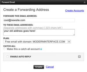
Email-ForwardingForwarding – email forwarding is a straightforward process. You have: cool@newsite.com, and people send mail to it. Then it is magically forwarded to your old address. On Godaddy, it’s free with your domain name, and you click “manage” (on the email line) then “create forward”.
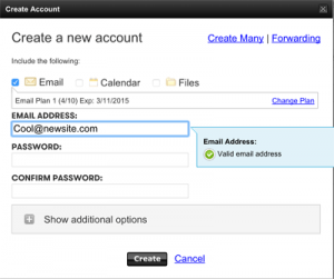


Dedicated-EmailDedicated address – This is a little more complicated, and not free. You pay a certain amount, and are allowed to create an email address. Your provider then receives those emails and stores them for you. You can access the emails on all your devices, and through all sorts of mail setups. Setting it up on Godaddy: “manage” (on the email line) then “create”.

So, what’s right for you?

If you’re a heavy email user, who wants to be able to sync emails across all your devices, a dedicated address is the right way to go. If, on the other hand, you just need to check your email at the office, you can probably get away with forwarding.


Some of our Favorite Websites

Colorful Triangles
As I am a web developer, I’m often asked “What’s your favorite website?” Well, there are about 650 million. I like a lot of websites for different reasons. So, it totally depends on the type of website. For instance, Google Drive is amazing from a programming point of view, but not pretty to look at necessarily. Websites exist for vastly different reasons. But to me, the best websites combine great organization, novelty and simplicity and beauty in design. Most importantly, a good website offers good communication! Here are just a quick few that make the cut.

Your Turn!
What are your favorite websites? Enter them below…

While many of these sites are on the more expensive site, probably between $10-20,000 or more, your site could have some of these features and still be remarkably effective… talk to us!

alan@moderninterface.com
503 214 8234


The Mission of Modern Interface

Every business should have a mission. It should be the guide for every decision made and the standard to which every action is held. Modern Interface has such a mission statement. It seems appropriate to list it here in the first blog post.

The mission of Modern Interface is to employ the best available means of internet technology for the lowest possible cost to help small businesses grow – constantly improving and adapting to new methods with keen discernment.

People are constantly inventing new ways to do things. Working with digital and interactive media is an exciting position to be in! Helping you make sense of it all is what we like to do.