CASE STUDY: Painting Specialist Website Design

If you live in Vancouver, WA, chances are you’ve noticed one of the Painting Specialist company vehicles.

Purple Truck

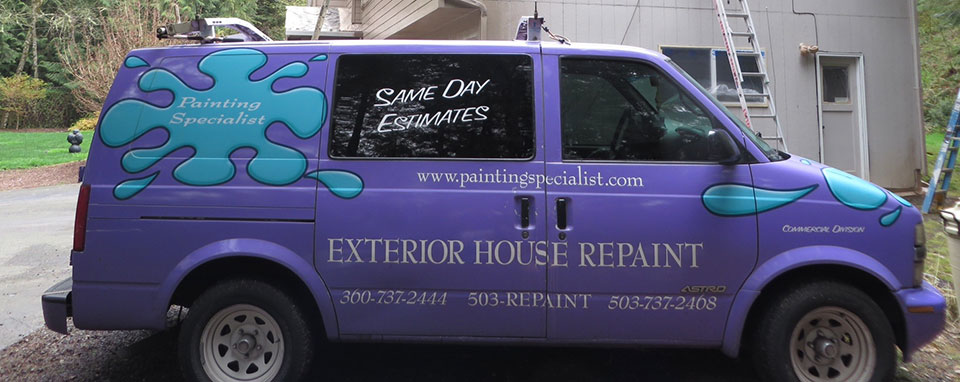
That’s powerful purple marketing! The problem was that their website was not so powerful and did not reflect their strong physical presence. Customers would chase purple trucks around town to get the phone number because they couldn’t find the company online. What they needed was a strong website design and marketing plan that would do the following:

  • Integrate the existing brand
  • Convey the high quality of work and longstanding good reputation of PS to the local market
  • Update the logo while retaining the strong recognition
  • Search Engine Optimization so customers could find that “purple truck” painting company

Updating the Branding

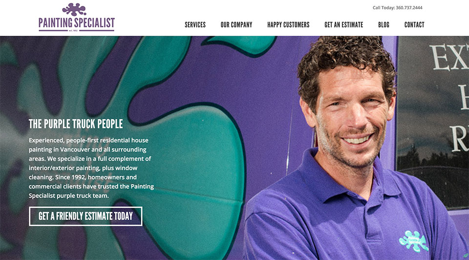
The former logo, the distinctive paint splotch, needed a bit of modernization, while still maintaining continuity. We decided to keep a smaller version of the splotch and emphasize the brand name.

Logo

Bringing the Website Design Home

Even though Painting Specialist does work all over the Northwest, we decided to emphasize the local nature of the business to home owners in the area. Garold grew up in Vancouver and has worked in painting since high school.

Including pictures of Garold, his team and photos of their clients and their clients’ homes, as opposed to stock photography was an important design choice. Conveying the truly personal and local nature of the business was imperative. The photography, combined with personal stories from Garold and the homeowners completes an important aspect of the website’s purpose.

No More Truck Chasing

You can provide the best service available, but if a potential customer can’t find you it doesn’t matter.  With some hard work, our proprietary search engine optimization methods have yielded excellent results for “purple truck painters” and related queries. This company illustrates how important excellent SEO is to engaging new customers.

Get to know Painting Specialist and come to love them like we have. Check out their website here!

Painting Specialist Website Design


Bad Design 1: Navigation Bar

While we like to show off great websites that we’ve created, I often have to wade through the internets shady back alley of design in the name of research. So, I thought maybe I should share some gems that epitomize what NOT to do. Run, no, Run Screaming, if someone tries to sell you on a site with design like this.Menu Bar


I stumbled upon this site while checking out a clients competitors. I always like to know what we’re up against. In this case, I spent several minutes exploring this site, for the same reason people have ugly sweater parties. The picture above is the navigation bar at the top of the site:

Let’s break this puppy down.

  • First off, there are a lot of menu options, so much that it takes 3 rows to fit it all. I’m already confused, and I haven’t even read them yet.
  • It gets worse! Yes, these are actually drop downs, under many of the headings, there are additional options! This must be the most complicated dental practice ever!
  • Argh!, it gets even worse! Unbelievably, several of the drop down menu items have a sub-menu. That’s 3 levels of menu, on top of the already excessive 3 rows!

So, what’s wrong with having a comprehensive menu?

  • If you think your visitors are going to go through 50+ pages, I’ve got a bridge to sell you…
  • I’m not even sure what “Endodontics” is, let alone if I need something that’s encompassed in the sub menus.
  • Confusing your customers is never a good business model (unless you’re a magician)
  • Your menu is a powerful conversion tool, this one doesn’t give me a clear call to action.

This practice would almost be better off with a website that said “Have teeth? Call us!”, as it’s only content. All joking aside, I can’t imagine who would click “contact” based on the website. That represents a real, tangible, loss of sales dollars for this business.


The cobbler finally gets around to making his childrens’ shoes

BootsEveryone has heard the old yarn about the cobbler whose own children are left barefoot. We can relate to that poor overworked cobbler, as we’ve been making do with a very basic website here at Modern Interface for far too long.

Well, the wait is over, and we’re pleased to unveil our shiny new website! Go ahead, check it out: ModernInterface.com.

It’s not all there yet. In the coming months, we are developing a magnificent app to help you determine specific needs and costs for developing a website, a sort of calculator on steroids. More details to come. Meanwhile, enjoy what we have and let us know what you think! And go ahead, buy that new pair of shoes, you deserve them!


Business Email – Forwarding Vs Dedicated

So you have a shiny new website on your awesome new domain name, and you’re thinking that customers might not want to send emails to iwuz18whenIsetthisup@gmail.com. But you need the emails to be able to go somewhere, so, what do you do?

Two options await you: Forwarding, and Dedicated address

Email-Forwarding
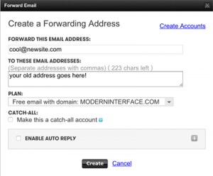
Forwarding – email forwarding is a straightforward process. You have: cool@newsite.com, and people send mail to it. Then it is magically forwarded to your old address. On Godaddy, it’s free with your domain name, and you click “manage” (on the email line) then “create forward”.


Dedicated-Email
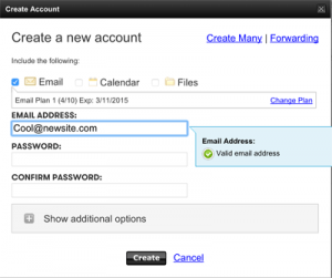
Dedicated address – This is a little more complicated, and not free. You pay a certain amount, and are allowed to create an email address. Your provider then receives those emails and stores them for you. You can access the emails on all your devices, and through all sorts of mail setups. Setting it up on Godaddy: “manage” (on the email line) then “create”.

So, what’s right for you?

If you’re a heavy email user, who wants to be able to sync emails across all your devices, a dedicated address is the right way to go. If, on the other hand, you just need to check your email at the office, you can probably get away with forwarding.


Branding Yourself: Personal vs. Professional

OfficeWhether you are a writer, musician, business owner, college grad or budding artist, you have an image. It’s an extension of who you are, an aura. It may be bold and easily recognizable or passive and harder to spot, but it’s there. It comes out in how you dress, how you do your job, how you drive, dance or make decisions. It’s an expression of who you are. If it’s weak, and you are trying to reach people, it might be time to turn up the volume. Without any discernable image, you will have a difficult time conveying who you are.

Sometimes there can be a temptation to hide behind a professional front. If you are a government agency, university or major corporation, this is preferable. But, if your audience is local and your reach is more hopeful than expected, an exclusively professional image will end up excluding the very people you are trying to reach.

People like people. (They dislike them as well, but that’s another article!) They prefer to deal with people rather than computers. That’s why it becomes paramount to pour out who you are into things that represents you, like websites and storefronts.

If one of your needs is to convey your abilities because they are not immediately apparent, such as for a doctor or architectural firm, then there is an opportunity to be creative. In Portland, we are fortunate to have a supportive community for blending creative talent and professional ability.

Some Bigger Examples

One of my favorite Portland businesses, New Seasons Market, has managed to keep their image personal through the years despite astounding growth. The colors, the fonts, the space, even the product line are all appealing. But the employees are the front-line extension of the owners. There is a careful attention to preservation of personality, not just functionality.

Whether you like their coffee or not, Stumptown Coffee has skewed their image corporate and professional. They reorganized a few years ago to go national. Their website does not feature people, but products, storefronts and lots of copy. For selling hot coffee, their image is, well, a bit cold.

Some Smaller Examples

Salt & Straw has a neat story to tell. Though their website is a bit dated, their branding is great. In the About Us section, you immediately feel like you know the owners, who are cousins. They tell their personal story and show candid photos of their lives.

VooDoo Doughnuts, while unappealing to me personally, definitely has a personality. In fact, their personality is so profound, that they have managed to garner quite a bit of national attention since they opened ten years ago.

Social Media and Branding

One of the most positive things about social media is that now there is a platform to connect directly with your fans, customers and clients outside of doing business. It’s really a very old-world concept. The difference is that now we share a lot more with a lot more people. It’s a natural place to express yourself. Granted, that can be a scary thing for some. It really ups the ante when it comes to offering consistent service to the public. Here are some tips:

  • Start small, test the waters.
  • Share who you are, don’t try to sell yourself. Talk about things you like.
  • At the same time, be sensitive and show some love. Not everyone will share your opinion.
  • Listen to your audience. Be open to criticism.

Be yourself. If people respond negatively, you can choose to ditch your efforts, change your audience or revisit who you are. The last one takes the most effort and is the least popular but tends to yield the best results.

Build your brand around your personality

Let your business extend around who you are. Decide what you want people to think of when they hear your name. When you don’t have to suppress your personality, you’ll enjoy your job even more!