


This dental practice has been running for over 40 years, and has an excellent word of mouth reputation in the area. But, they had no web presence and decided it was time to reach out to their market on the web.
Requirements:
- Rebrand to capture the spirit of the practice: laid back but professional, fun and friendly
- Mobile friendly website design for families on the go
- Reach out to younger demographic
- Meet the needs of both new and existing patients
Starting from scratch
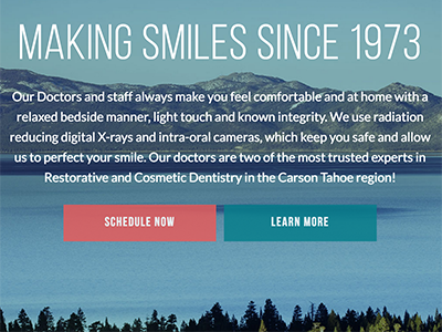
We started with the end goals of the project and worked backward, building a strategy. The Digital Marketing Plan was created to guide the creation of the site, its architecture and the plan to market the practice over the web. Along the way, we created a new logo, choosing typography and colors to express the brand story. We worked to pick a name that best met the goals of the practice: Carson-Tahoe Family Dental Care. We designed every aspect of each page to support the end goals.

Photography is critical for most of our website designs, so we flew to their location (Carson City, NV) for the shoot. The photos let people know that they are dealing with fun professionals who desire a real relationship with their patients.
It will take a few months to realize the full benefit of the Search Engine Optimization work we did, but the visual results speak for themselves. Carson-Tahoe Dental now has a website designed with intent that conveys a clear message: This isn’t your typical dentist. Check it out and let us know what you think! Also observe the speed and the way the site looks on mobile phones and tablets.

 Now that you’ve “come in” I start introducing you to everyone and everything, telling you fluffy’s life story, and how bobby the neighbor boy just broke his arm at the local playground. At this point, you might be feeling a little bit awkward, and saying to yourself “why am I here”, and “when can I leave”.
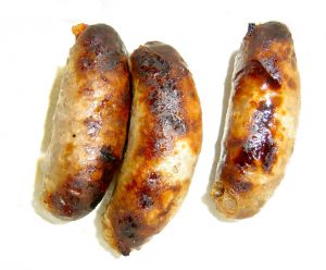 e just moved to the Eastbank Commerce Center, on Water ave, and even though we can almost see our old office across the river, as far as food options go, it’s like we’ve moved to another city fifty years ago. From the previous office, we were right around the block from a slew of food carts. (Oh how we miss you Sonny Bowl) There were also tons of other vegan / gluten free options within easy walking distance.
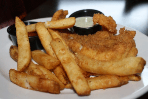 ve discovered why the east bank is referred to as the “industrial” district. It’s clearly a reference to the size of the deep fryers at the brew pubs littering the area. Imagine going from 6 great vegan options at one food cart, to 6 options within a couple blocks, and three of those are actually deep fried. And really, can you even count a side of tots as an option?
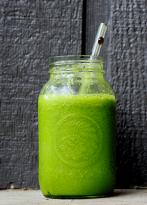 pe though, veganism appears to be sprouting and sending out gluten free shoots in the area. A Kure juicing company has opened across the street, and I discovered Cookies Cupcakes and more, which opened a few weeks ago under the hawthorne bridge. The more includes a fairly robust menu of vegetarian options. and if you get at least 3 flavors of cupcakes, that makes a complete meal, right?