


This dental practice has been running for over 40 years, and has an excellent word of mouth reputation in the area. But, they had no web presence and decided it was time to reach out to their market on the web.
Requirements:
- Rebrand to capture the spirit of the practice: laid back but professional, fun and friendly
- Mobile friendly website design for families on the go
- Reach out to younger demographic
- Meet the needs of both new and existing patients
Starting from scratch
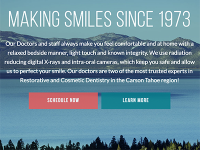
We started with the end goals of the project and worked backward, building a strategy. The Digital Marketing Plan was created to guide the creation of the site, its architecture and the plan to market the practice over the web. Along the way, we created a new logo, choosing typography and colors to express the brand story. We worked to pick a name that best met the goals of the practice: Carson-Tahoe Family Dental Care. We designed every aspect of each page to support the end goals.

Photography is critical for most of our website designs, so we flew to their location (Carson City, NV) for the shoot. The photos let people know that they are dealing with fun professionals who desire a real relationship with their patients.
It will take a few months to realize the full benefit of the Search Engine Optimization work we did, but the visual results speak for themselves. Carson-Tahoe Dental now has a website designed with intent that conveys a clear message: This isn’t your typical dentist. Check it out and let us know what you think! Also observe the speed and the way the site looks on mobile phones and tablets.