Bad Design 1: Navigation Bar

While we like to show off great websites that we’ve created, I often have to wade through the internets shady back alley of design in the name of research. So, I thought maybe I should share some gems that epitomize what NOT to do. Run, no, Run Screaming, if someone tries to sell you on a site with design like this.Menu Bar


I stumbled upon this site while checking out a clients competitors. I always like to know what we’re up against. In this case, I spent several minutes exploring this site, for the same reason people have ugly sweater parties. The picture above is the navigation bar at the top of the site:

Let’s break this puppy down.

  • First off, there are a lot of menu options, so much that it takes 3 rows to fit it all. I’m already confused, and I haven’t even read them yet.
  • It gets worse! Yes, these are actually drop downs, under many of the headings, there are additional options! This must be the most complicated dental practice ever!
  • Argh!, it gets even worse! Unbelievably, several of the drop down menu items have a sub-menu. That’s 3 levels of menu, on top of the already excessive 3 rows!

So, what’s wrong with having a comprehensive menu?

  • If you think your visitors are going to go through 50+ pages, I’ve got a bridge to sell you…
  • I’m not even sure what “Endodontics” is, let alone if I need something that’s encompassed in the sub menus.
  • Confusing your customers is never a good business model (unless you’re a magician)
  • Your menu is a powerful conversion tool, this one doesn’t give me a clear call to action.

This practice would almost be better off with a website that said “Have teeth? Call us!”, as it’s only content. All joking aside, I can’t imagine who would click “contact” based on the website. That represents a real, tangible, loss of sales dollars for this business.


How Bone Marrow Ice Cream Can Help Your Business

Sounds disgusting right? But deep down, you kind of want to try it. It’s a seasonal flavor at Salt & Straw a uniquely Portland ice cream shop. So what does Bone Marrow ice cream have to do with your business?

#1 – If I said “how plain old vanilla ice cream can help your business”, you probably wouldn’t be reading this. Bone Marrow ice cream is outside the expected parameters of flavors, and as such draws attention. Think of ways your business could garner extra attention, go ahead, I dare you to put a 5 gallon barrel of coffee on the menu.

#2 – If you’re into bone marrow, and I know some of you are already salivating, you’re pretty much guaranteed to go to Salt & Straw ahead of any other ice cream shop in Portland. This is the essence of niche marketing, even if you didn’t order bone marrow, you’d still go, just to have the option. What niche can your business fill?

#3 – Once you’ve cracked open a pint of bone marrow, really, everything else seems pretty tame. If you’re selling something strange or expensive, nothing helps sales more than having something even MORE strange or expensive to offer. Your customers can rationalize it with “At least I didn’t get the OTHER one!”


So go ahead, eat a squid tentacle sandwich wearing a speedo in the rain, then put the pictures up and proudly declare “THIS, is the REAL me”. There are others like you out there, maybe more than you think. Permission granted to take a break from normal!


Some of our Favorite Websites

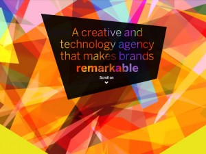
Colorful Triangles
As I am a web developer, I’m often asked “What’s your favorite website?” Well, there are about 650 million. I like a lot of websites for different reasons. So, it totally depends on the type of website. For instance, Google Drive is amazing from a programming point of view, but not pretty to look at necessarily. Websites exist for vastly different reasons. But to me, the best websites combine great organization, novelty and simplicity and beauty in design. Most importantly, a good website offers good communication! Here are just a quick few that make the cut.

Your Turn!
What are your favorite websites? Enter them below…

While many of these sites are on the more expensive site, probably between $10-20,000 or more, your site could have some of these features and still be remarkably effective… talk to us!

alan@moderninterface.com
503 214 8234


What is a modern interface?

SignMany business owners are entrepreneurial in spirit – naturally savvy and proactive. And almost every business owner has a website. But taking the time to understand how a website can function as a solid business asset is often moved to the back burner. It involves investing a significant amount of time that business owners rarely have much of. The alternative, as with many functions of business, is to outsource. But, this outsourcing requires confidence that the investment will yield a return.

For a restaurant, street signage is usually a no-brainer. While the amount spent on a sign can vary widely, at a minimum the sign lets a patron know that the restaurant does indeed exist in a nearby location. At a maximum, the sign can draw the attention of would-be patrons who suddenly became hungry upon viewing the sign. Or perhaps when hunger surfaces later, they recall their earlier interest in the restaurant with “that sign.”

Building signs still serve these purposes. Now however, a virtual neighborhood exists with signs that are a bit more elusive. These signs can be significantly more impressive, informative, clever, effective and, as such, expensive. The new paradigm is not just about locale, but is also niche-based. Customers can now easily find a local Italian restaurant with low-carb, gluten-free or kid-friendly options.

If you do not run a generic business, then you should not have a generic web presence.

The steps to effective digital marketing are straightforward:

  1. Brand appropriately – Go beyond using only words to represent your business
  2. Direct desiring patrons to your virtual storefront with modern signage: Social media platforms, organic and paid search engine results all require thoughtful intent
  3. Win the favor of your niche patrons and call them to action by investing not in a “brochure site,” but in a virtual maître d’.

But such an implementation requires knowledge, skill and time – a proper investment. Thankfully, the efficacy of this investment can now be measured fairly well. As a result, your money is better spent and your customers are happier. After all, they are looking specifically for your services. By outsourcing, you can focus your efforts on enhancing the experience of your customers – who are likely to review you publicly.

Why is Modern Interface different?

At Modern Interface, we have top creative talent when it comes to overall branding and a good knack for helping you represent your particular culture or philosophy. This talent reaches from the perfect logo all the way to the overall customer experience. Video, photography, print and copy are all services we provide in coordination with winning websites.

Good branding must be combined with reaching the right people in the right places. We also provide this effective marketing expertise on both technical and non-technical levels. Search Engine Optimization (SEO) is not a switch or even a set of switches. It is an ongoing strategic effort that requires experience, planning, execution and continuous evaluation. And advertising with social media is much more personal than a newspaper ad, requiring patience and a good understanding of your fans and followers.

The results we offer may be more than many businesses are looking for or have a budget for. We typically work with client budgets of $3,000 to $15,000 who provide valuable services or products, who desire to connect with their customers digitally and grow their business, but who are not currently satisfied with their branding, image or web presence.


What is digital marketing all about?

sidewalkWhy should you care about digital marketing in Portland? After all, isn’t Portland one of those hyper-local places where people just know where businesses are and what they are about? Isn’t part of the fun discovering new places on foot and by word of mouth?

Indeed, this is true. However, people are steadily migrating to Portland, despite economic conditions. Rents are being raised at astonishing rates. To help guide newcomers to your business, a focused digital marketing presence is required. An aggressive campaign with annoying ads can be distasteful and expensive. But being there when a customer is looking for you is a different story. Being accessible, helpful and downright appealing draws in the perceptive, intellectual customers you are looking for. Skill is required to pull this off properly.

Besides newcomers and city visitors to Portland, most long-time residents look up new places frequently. Businesses are searched in a number of ways, mostly via Google. But, other directories, whether websites or apps, especially those with reviews, such as Yelp, are also widely used, sometimes just to find out whether a restaurant has gluten-free options or is kid-friendly.

Whether the result of a search engine, a casual social media mention on Facebook, a tweeted video or a direct hit, customers either land at your website or a listing before buying. All of the above (your “total web presence”) need to be accurate, inviting, helpful and consistent.

Wouldn’t it be great if there were creative types, who were also business experts, who could pull off a great experience for your customers? There are! Modern Interface is a small collaborative company with combined degrees and experience in both business (U. of Ala.) and art (Art Center in California). Our experience is well-rounded: advertising, web programming, branding, graphic design, business development and administration. We consult, research, target, plan and execute.

What we desire is to help our clients grow by making best use of awesome technologies at a low cost. We refine our processes, improving them constantly, and personalize each experience. And we often have a lot of fun working with our clients! We’re here because we love it. The internet is a fresh and fun place to work. Putting smiles on our clients’ faces is the cherry on top.

Any questions about digital marketing? Ask below!