In todays competitive market, a website alone isn’t enough for your small business to thrive. If you provide quality services, you need to promote your business, and reach out to engage your potential customers. After all, what good is a fantastic website if no one sees it? Little Shredders Pediatric Dentistry is an example of a startup firing on all cylinders.
When Dr. Christopher Swisher decided to open his own pediatric dental practice in Hood River, Oregon, he knew he wanted his practice to be “out of the box.” We partnered with Dr. Swisher to create a winning website and a dynamic digital marketing plan.
Winning website with Search Engine Optimization
The result of all these efforts? Little Shredders is a thriving practice, with people raving about Dr. Swisher’s excellent care of their children.
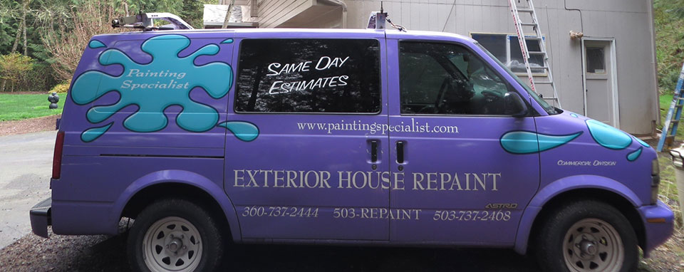
If you live in Vancouver, WA, chances are you’ve noticed one of the Painting Specialist company vehicles.
That’s powerful purple marketing! The problem was that their website was not so powerful and did not reflect their strong physical presence. Customers would chase purple trucks around town to get the phone number because they couldn’t find the company online. What they needed was a strong website design and marketing plan that would do the following:
Integrate the existing brand
Convey the high quality of work and longstanding good reputation of PS to the local market
Update the logo while retaining the strong recognition
Search Engine Optimization so customers could find that “purple truck” painting company
Updating the Branding
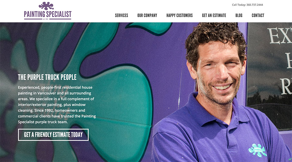
The former logo, the distinctive paint splotch, needed a bit of modernization, while still maintaining continuity. We decided to keep a smaller version of the splotch and emphasize the brand name.
Bringing the Website Design Home
Even though Painting Specialist does work all over the Northwest, we decided to emphasize the local nature of the business to home owners in the area. Garold grew up in Vancouver and has worked in painting since high school.
Including pictures of Garold, his team and photos of their clients and their clients’ homes, as opposed to stock photography was an important design choice. Conveying the truly personal and local nature of the business was imperative. The photography, combined with personal stories from Garold and the homeowners completes an important aspect of the website’s purpose.
No More Truck Chasing
You can provide the best service available, but if a potential customer can’t find you it doesn’t matter. With some hard work, our proprietary search engine optimization methods have yielded excellent results for “purple truck painters” and related queries. This company illustrates how important excellent SEO is to engaging new customers.
Our client, FundAmerica, was in need of a complete website redesign and rebuild. We rethought their content into a great new visual design that clearly and effectively expresses the complex financial technology services they provide.
We launched the new website on November 20, 2014. Six months later, things are going incredibly well.
Baseline
Analytics from the old site are not available, so we used the first 30 days of the new site’s life as the baseline.
Traffic Results
If you need a refresher on Google Analytics check out this blog.
Sessions were up 400%
Total New Users jumped an incredible 800%
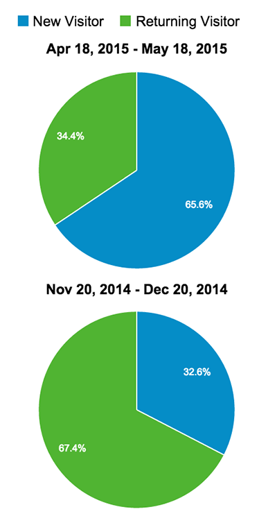
New User %: 66% vs 33% (see graph on right)
Organic Traffic share – up 1220% (to 49% share)!
Analysis: Overall traffic more than quadrupled. New users dominated, which is exactly what you want to see with an SEO campaign. Direct traffic (typing in or clicking a bookmark) more than doubled and Search traffic increased dramatically, rising to almost half of all visitors.
Bottom Line: Google thinks the new site is worth putting high in search results, and users are validating that choice by clicking through. We call this a huge success, and can’t wait to see the progress at one year.
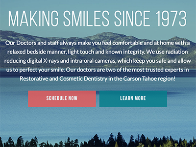
This dental practice has been running for over 40 years, and has an excellent word of mouth reputation in the area. But, they had no web presence and decided it was time to reach out to their market on the web.
Requirements:
Rebrand to capture the spirit of the practice: laid back but professional, fun and friendly
Mobile friendly website design for families on the go
Reach out to younger demographic
Meet the needs of both new and existing patients
Starting from scratch
We started with the end goals of the project and worked backward, building a strategy. The Digital Marketing Plan was created to guide the creation of the site, its architecture and the plan to market the practice over the web. Along the way, we created a new logo, choosing typography and colors to express the brand story. We worked to pick a name that best met the goals of the practice: Carson-Tahoe Family Dental Care. We designed every aspect of each page to support the end goals.
Photography is critical for most of our website designs, so we flew to their location (Carson City, NV) for the shoot. The photos let people know that they are dealing with fun professionals who desire a real relationship with their patients.
It will take a few months to realize the full benefit of the Search Engine Optimization work we did, but the visual results speak for themselves. Carson-Tahoe Dental now has a website designed with intent that conveys a clear message: This isn’t your typical dentist. Check it out and let us know what you think! Also observe the speed and the way the site looks on mobile phones and tablets.
Imtakt USA is a Portland-based company that sells chromatography columns. It’s ok if you don’t know what that means, we didn’t either until they explained it. Basically, it’s a scientific instrument that is used in a variety of chemical and pharmaceutical research. Imtakt USA has a strong existing customer base, who have been using an aged, unfriendly site to find important articles and make purchases. They asked us to build out a website in WordPress with the following requirements to meet their marketing objectives:
Custom WordPress theme per supplied design
E-commerce functionality for 1000+ products over 16 product lines
Advanced search functions for technical library of 750+ scientific papers
Seamless URL transition for customers who relied on information from old site
We are seeing about an 80% increase in online sales and probably double the amount of technical requests. – Robert Puryear, COO
Front End Website Design
The design mockups they supplied were great, with clear page layouts and easy navigation. They also included robust product data sections for their target market of PhD wielding scientists. We built out the custom theme and loaded it onto a WordPress install. Next we needed to set up the E-commerce functionality.
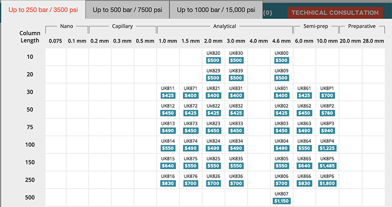
Woocommerce was an easy choice for the shopping cart, as it could handle the complex product requirements and would be easy for the client to use down the road. We built a selection grid and linked it to the product database where you can pick out the specific size of product you want to buy. There are even tabs for higher pressure applications that feature addition SKUs.
Back End Design
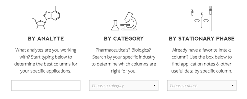
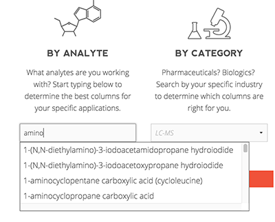
Since Imtakt works directly with scientists, the search functionality had to be top notch. We exported their existing database, then rebuilt it to modernize the structure and speed it up. The results are pretty cool. The first box is an autocomplete text box of over 1000 compounds. The second box is a category list. And the third box is product line specific.
Even if you don’t want to read any of the papers, you should still swing by and check out Imtakt USA!