Little Shredders – A Digital Marketing Success Story

In todays competitive market, a website alone isn’t enough for your small business to thrive. If you provide quality services, you need to promote your business, and reach out to engage your potential customers. After all, what good is a fantastic website if no one sees it? Little Shredders Pediatric Dentistry is an example of a startup firing on all cylinders. Dr Chris Swisher


When Dr. Christopher Swisher decided to open his own pediatric dental practice in Hood River, Oregon, he knew he wanted his practice to be “out of the box.” We partnered with Dr. Swisher to create a winning website and a dynamic digital marketing plan.

Winning website with Search Engine Optimization

Little Shredders Dental website is a fun reflection on the personality of Dr. Swisher and the community of Hood River. It conveys the fact that he isn’t your typical dentist, he genuinely understands kids.

In addition to the visual design, we knew we needed strong SEO to show up on Google. We needed people around the Hood River area to be able to find his awesome new website. Our focus was on searches relating to “pediatric dentist” and “Hood River”. We’re happy to say that Little Shredders is listed first on the Search Engine Results Page (SERP) for a variety of related searches.

Social Media Marketing

Hood River is a smaller community so we knew social media marketing would play a very large role in getting the word out. Following our Digital Marketing Plan, Dr. Swisher quickly built a following on Facebook, the primary focus of the social media efforts. We recently ran a campaign to further spread the word in the surrounding area, and reached over 10,000 people with more than 200 clicks through to the website!

Reviews are more important than ever, and Chris has chalked up 20+ on Facebook, and is now focusing on Google to grow the portfolio there.Wind Surfer

Traditional Local Marketing

The other critical piece of the marketing is community involvement. Dr Swisher participates in local area events, bringing the Shredder bus, and sponsoring with free pizza, etc. As a Hood River native, he demonstrates his care and desire to improve his community.

Little Shredders Booth


The result of all these efforts? Little Shredders is a thriving practice, with people raving about Dr. Swisher’s excellent care of their children.


CASE STUDY: Painting Specialist Website Design

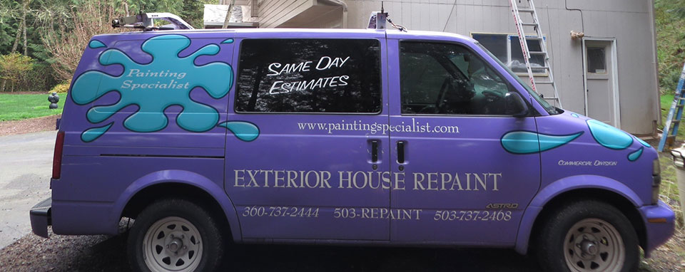
If you live in Vancouver, WA, chances are you’ve noticed one of the Painting Specialist company vehicles.

Purple Truck

That’s powerful purple marketing! The problem was that their website was not so powerful and did not reflect their strong physical presence. Customers would chase purple trucks around town to get the phone number because they couldn’t find the company online. What they needed was a strong website design and marketing plan that would do the following:

  • Integrate the existing brand
  • Convey the high quality of work and longstanding good reputation of PS to the local market
  • Update the logo while retaining the strong recognition
  • Search Engine Optimization so customers could find that “purple truck” painting company

Updating the Branding

The former logo, the distinctive paint splotch, needed a bit of modernization, while still maintaining continuity. We decided to keep a smaller version of the splotch and emphasize the brand name.

Logo

Bringing the Website Design Home

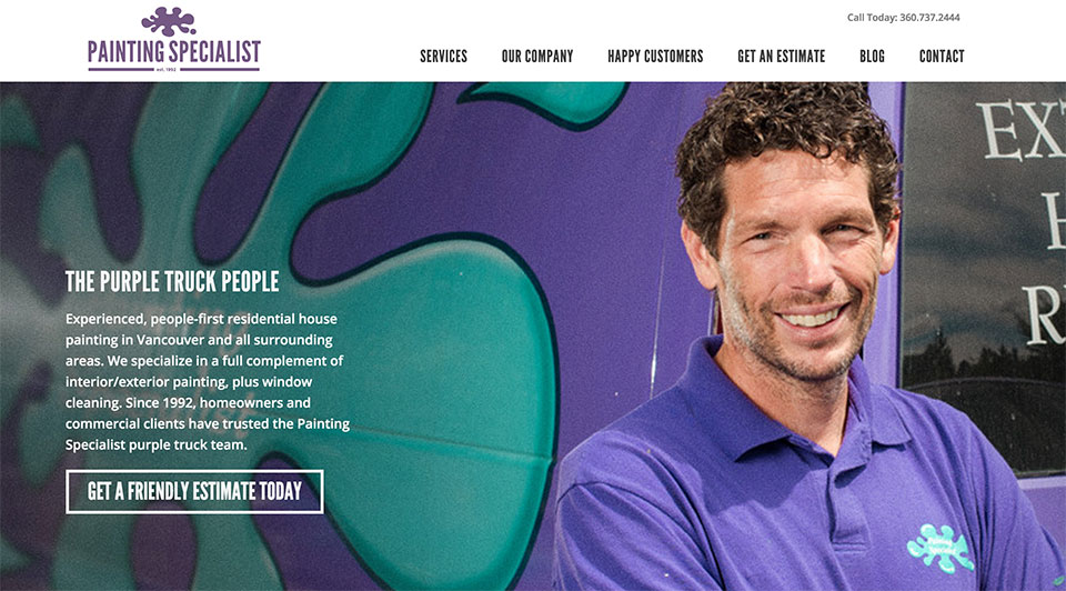
Even though Painting Specialist does work all over the Northwest, we decided to emphasize the local nature of the business to home owners in the area. Garold grew up in Vancouver and has worked in painting since high school.

Including pictures of Garold, his team and photos of their clients and their clients’ homes, as opposed to stock photography was an important design choice. Conveying the truly personal and local nature of the business was imperative. The photography, combined with personal stories from Garold and the homeowners completes an important aspect of the website’s purpose.

No More Truck Chasing

You can provide the best service available, but if a potential customer can’t find you it doesn’t matter.  With some hard work, our proprietary search engine optimization methods have yielded excellent results for “purple truck painters” and related queries. This company illustrates how important excellent SEO is to engaging new customers.

Get to know Painting Specialist and come to love them like we have. Check out their website here!

Painting Specialist Website Design


CASE STUDY: Carson Tahoe Dental

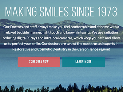
Carson Tahoe Website Design

This dental practice has been running for over 40 years, and has an excellent word of mouth reputation in the area. But, they had no web presence and decided it was time to reach out to their market on the web.

Requirements:

  • Rebrand to capture the spirit of the practice: laid back but professional, fun and friendly
  • Mobile friendly website design for families on the go
  • Reach out to younger demographic
  • Meet the needs of both new and existing patients

Starting from scratch

Carson-Tahoe-logo-color

We started with the end goals of the project and worked backward, building a strategy. The Digital Marketing Plan was created to guide the creation of the site, its architecture and the plan to market the practice over the web. Along the way, we created a new logo, choosing typography and colors to express the brand story. We worked to pick a name that best met the goals of the practice: Carson-Tahoe Family Dental Care. We designed every aspect of each page to support the end goals.

Dental Client Photo

Photography is critical for most of our website designs, so we flew to their location (Carson City, NV) for the shoot. The photos let people know that they are dealing with fun professionals who desire a real relationship with their patients.

It will take a few months to realize the full benefit of the Search Engine Optimization work we did, but the visual results speak for themselves. Carson-Tahoe Dental now has a website designed with intent that conveys a clear message: This isn’t your typical dentist. Check it out and let us know what you think! Also observe the speed and the way the site looks on mobile phones and tablets.


CASE STUDY: Imtakt USA

Imtakt-LogoImtakt USA is a Portland-based company that sells chromatography columns. It’s ok if you don’t know what that means, we didn’t either until they explained it. Basically, it’s a scientific instrument that is used in a variety of chemical and pharmaceutical research. Imtakt USA has a strong existing customer base, who have been using an aged, unfriendly site to find important articles and make purchases. They asked us to build out a website in WordPress with the following requirements to meet their marketing objectives:

  • Custom WordPress theme per supplied design
  • E-commerce functionality for 1000+ products over 16 product lines
  • Advanced search functions for technical library of 750+ scientific papers
  • Seamless URL transition for customers who relied on information from old site
Imtakt-Hero

We are seeing about an 80% increase in online sales and probably double the amount of technical requests. – Robert Puryear, COO


Front End Website Design

The design mockups they supplied were great, with clear page layouts and easy navigation. They also included robust product data sections for their target market of PhD wielding scientists. We built out the custom theme and loaded it onto a WordPress install. Next we needed to set up the E-commerce functionality.

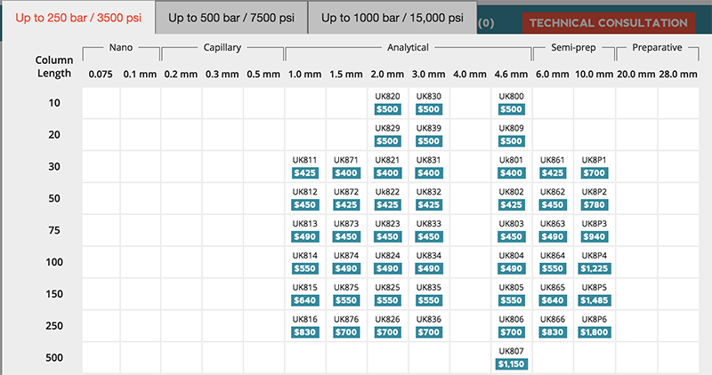
Woocommerce was an easy choice for the shopping cart, as it could handle the complex product requirements and would be easy for the client to use down the road. We built a selection grid and linked it to the product database where you can pick out the specific size of product you want to buy. There are even tabs for higher pressure applications that feature addition SKUs.

Pricing-Matrix
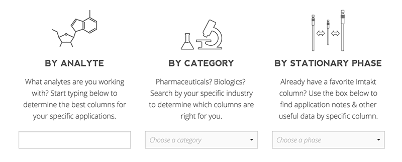
Search-Boxes

Back End Design

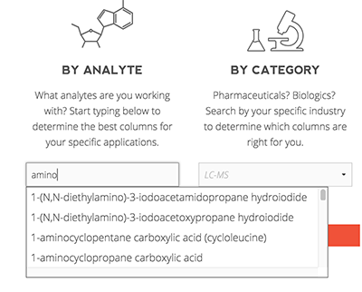
Since Imtakt works directly with scientists, the search functionality had to be top notch. We exported their existing database, then rebuilt it to modernize the structure and speed it up. The results are pretty cool. The first box is an autocomplete text box of over 1000 compounds. The second box is a category list. And the third box is product line specific.

Analyte-Dropdown
These can be used stand alone, or combined with each other to refine the search. It is possible to see all of the application notes for say, amino acids, but filter by the ones you can run on the column you already own. Now you can read all about “Use of the Intrada Amino Acid column along with tandem mass spectrometry allows for separation and detection of all 20 standard amino acids in under 20 minutes.”

Even if you don’t want to read any of the papers, you should still swing by and check out Imtakt USA!


Vegan-Free Gluten, An East-Bank Food Search

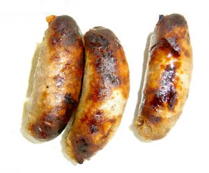
WSausagee just moved to the Eastbank Commerce Center, on Water ave, and even though we can almost see our old office across the river, as far as food options go, it’s like we’ve moved to another city fifty years ago. From the previous office, we were right around the block from a slew of food carts. (Oh how we miss you Sonny Bowl) There were also tons of other vegan / gluten free options within easy walking distance.
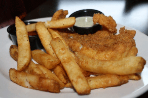
I’Friesve discovered why the east bank is referred to as the “industrial” district. It’s clearly a reference to the size of the deep fryers at the brew pubs littering the area. Imagine going from 6 great vegan options at one food cart, to 6 options within a couple blocks, and three of those are actually deep fried. And really, can you even count a side of tots as an option?

There is hoGreen smoothiepe though, veganism appears to be sprouting and sending out gluten free shoots in the area. A Kure juicing company has opened across the street, and I discovered Cookies Cupcakes and more, which opened a few weeks ago under the hawthorne bridge. The more includes a fairly robust menu of vegetarian options. and if you get at least 3 flavors of cupcakes, that makes a complete meal, right?