If you are a small business owner, the word “Vacation” may cause an odd stress reaction. Likely, this is either because you don’t remember the last time you took one, or because the thought of taking one causes a mild panic attack. But the reality is that vacations are good for you and your business. In addition to the well known health benefits of relaxation, you also recharge your creativity, making you even more productive when you return.
So, instead of throwing the vacation out the window, here are a few ideas to make it easier.
Don’t Think All or Nothing: It doesn’t have to be a cruise or a month on the Riviera to count as a vacation. Sometimes a long weekend can be just what you need to re-charge. Start small. Pick someplace close by that’s a favorite place you’ve always wanted more time to explore. Or try a “stay-cation” and do all the local tourist activities you’ve never had time to experience.
A Little Preparation Goes a Long way: If you’re gone for more than a couple days, look through your calendar to see what you would be working on during that time. Pay the bills, assign your regular tasks to specific employees, let your clients know you will be gone and who their contact person is, and don’t begin any new projects right before you leave.
To Call or Not to Call – That’s Really the Question: Decide before you leave if you will be in contact with your office, how much and when. Also clarify with your staff what constitutes an emergency. If the thought of completely unplugging stresses you out, set yourself a time limit, say, 30 minutes each day, for the most urgent business.
A Little Extra Wiggle Room: Give yourself an extra day at the end of your time off to re-group. You will have email and snail mail to catch up on, and the mental process of getting yourself “back in the game.” And there are bound to be personal items at home that you will need to handle. Even a half day can make it easier to slide back into your ergonomic desk chair.
Anticipation: Just the process of planning a vacation can be fun. Even if it’s only a short one, it focuses you on something outside of the day to day. When you return and realize that vacations can work, you have the anticipation of planning the next one.
So take a break! Caring for yourself should be a priority. After all, you are your business’s greatest asset.
If you are not using analytics, it’s like driving with a blindfold on. Even if you don’t crash, you will never know if you have been driving in circles or reached your destination. In this guide you will learn how to use Google Analytics to see how many people are coming to your site, where they came from and what they are looking at. Armed with this information, you will be able to create the content that gets and converts more visitors!
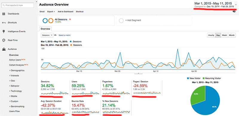
Analytics Dashboard
When you log in to your account you are greeted with an array of menu options, graphs, and stats. Let’s go through these one by one to get familiar with some of the terms.
Sessions – Each time a visitor comes to your site it’s a session.
Users – This is how many unique visitors look at your site.
Pageviews – Each and every page that is seen by a visitor is counted here.
Pages / Session – This is the average # of pages that each visitor views.
Avg. Session Duration – An average of how long a visitor spends at your site.
Bounce Rate – This is how many people left without visiting more than one page.
% New Sessions – This is an estimate of what percentage of users have never been to the site before (in your reporting period).
In the following example I set the date range to a previous period for comparison. Now all our stats show the percent of gain or loss. Google even colors them red and green to let you know if it’s a good or bad change.
Interpreting the data
In the example above, you can see that sessions went up 34% and users went up a whopping 59%. That’s fantastic! On the other side, even though we had 60% more users, the total number of pages served was almost identical. That drags down the pages / session to -24%. Also, the average duration is way down and the bounce rate is up. The new sessions statistic is up, but not as much as new users.
What does this mean? The data is a bit confusing. Normally, if you have an increase in visitors, you would get an equivalent percentage increase of page views, while pages/session, average duration, and bounce rate wouldn’t change by more than a few percentage points. Obviously, we need more information to figure out what happened. Did we do something that could explain this? Possibilities include:
Running paid ads – If an ad campaign brings in users, but they don’t stay, that could explain the data.
Social media – Was there some major buzz on social media that brought in casual visitors?
Website changes – Did we make a major change lately?
Spam bots – To me this looks like it could be a bad case of spam bots.
Spam bots are the plague of the internet, polluting your comments, and in this case, your analytics, all in the hope of getting you go to their website where they can try to sell you something, or infect your computer with a virus.
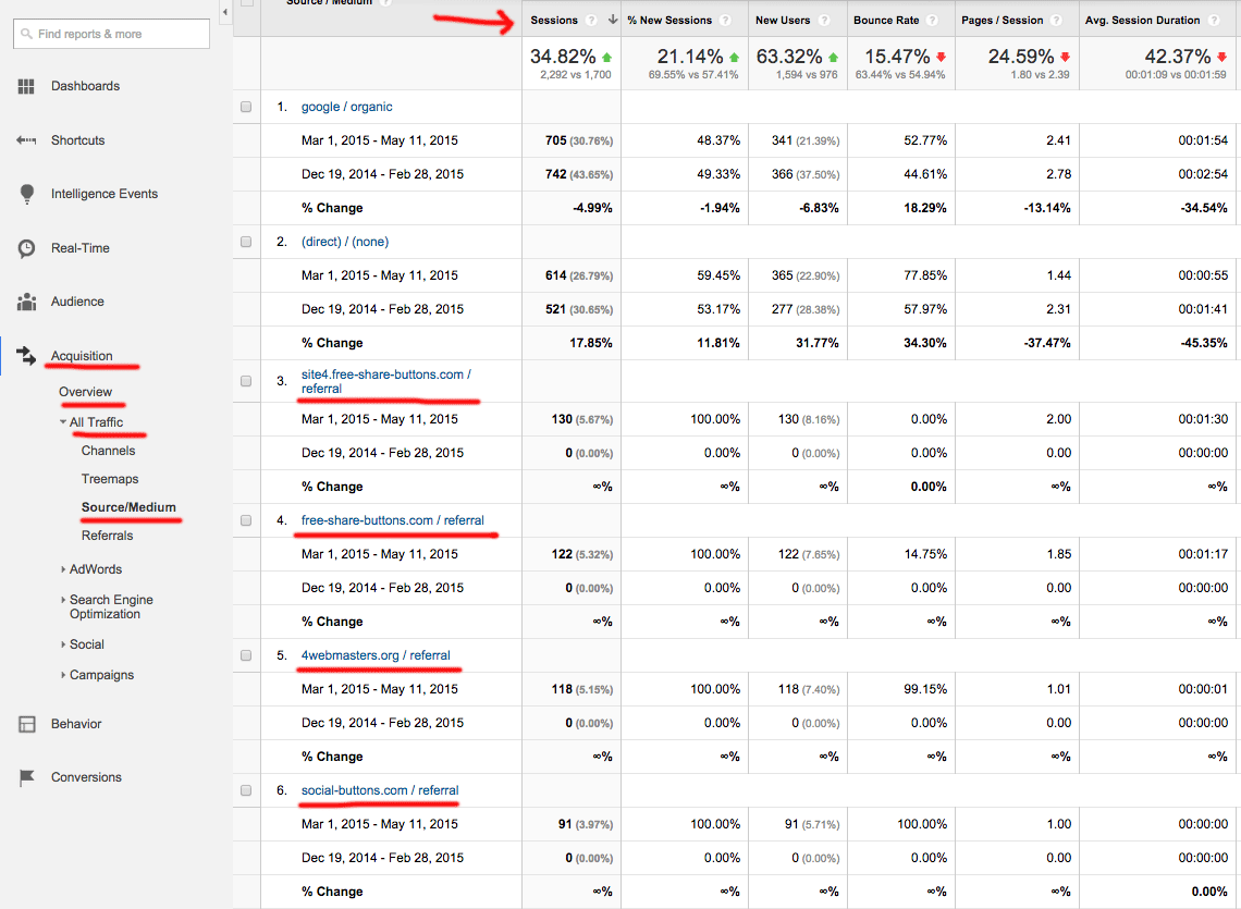
Fortunately, there’s an easy way to find out where these new visitors came from. Follow the navigation links to the “Source/Medium” page: Acquisition > Overview > All Traffic > Source/Medium
Checking the source
This page breaks out our visitors, using the same familiar stats, based on where they came from. They are then sorted in rank according to the number of sessions. Let’s have a look:
1. google / organic – These visitors came from a google search, probably your most important source.
2. (direct) / (none) – These visitors either have your site bookmarked, typed it in directly, or the site they came from didn’t provide a referral header.
3. site4.free-share-buttons.com – Hmm, just looking at the name makes me suspicious that this is a spam bot. Look at the stats: 130 visitors, all new, with a 0% bounce rate, they visited exactly 2 pages each. This is NOT human behavior!
4. free-share-buttons.com – This name seems familiar doesn’t it?
5. 4webmasters.org – 118 visitors with an average duration of 1 second, definitely a spam bot.
6. social-buttons.com – Another spam bot with a duration of 0 seconds.
The list goes even further, but you get the point. If we add up all the spam bots we get the answer to our confusing data – over 500 new visits from spam bots! Our human traffic didn’t change that much.
This page isn’t just useful for weeding out the spam bots, we can also see how many people came to us through Facebook, Yelp, and other sites that have links pointing to us. When you put some new content around the web, check to see which platforms are sending the most traffic! If you’re having trouble with spam check out this article to get rid of it.
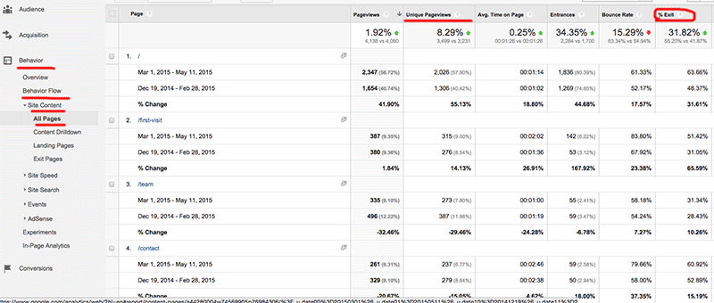
Now that we know how many visitors have come, and where they are coming from, let’s check out what they’re looking at. Behavior > Behavior Flow > Site Content > All Pages
Page level analysis
This view introduces a couple of variations on our familiar stats.
Unique Pageviews – This only counts once no matter how many times someone visits the same page.
% Exit – This is how many people left the website after visiting that page.
Bounce rate – This is a little different on this page. It’s measuring the % of people who left after landing on that page. ie. they came directly to that page, then left without visiting any other pages.
From this chart we can see that after the home page, represented as “/”, the page called “first-visit” is the most popular. Furthermore, 50% of the people that end up on this page leave the website. If you find a disproportionate percentage of people are leaving your site from a page, it may need some tweaking. If people are coming to a page, but then leaving after only a short time, the content may not be meeting their expectations.
Another excellent use of this tool is gauging how much traffic blogs receive. You don’t want to spend time writing blogs that no one wants to read. When readers find an article interesting, they will stay on the page longer, and share it with others. Looking at which blogs have the most views and longest duration, you can begin to develop a profile of what your customers find valuable. Do they like topics that are entertaining, informative, educational, artistic or a variety? Now you know, and can become their “go-to” site.
So how do I use this to make my business better?
Let’s review the top ways you can use Google Analytics to improve your content, increase your traffic, and convert more visitors.
Check your traffic stats to see if you’re winning the attention war.
Filter out spam bot traffic, and check how many actual people are coming from ad campaigns, social media, and email newsletters.
See what content is most popular.
What are your favorite stats from Google Analytics? Please post in the comments!
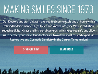
This dental practice has been running for over 40 years, and has an excellent word of mouth reputation in the area. But, they had no web presence and decided it was time to reach out to their market on the web.
Requirements:
Rebrand to capture the spirit of the practice: laid back but professional, fun and friendly
Mobile friendly website design for families on the go
Reach out to younger demographic
Meet the needs of both new and existing patients
Starting from scratch
We started with the end goals of the project and worked backward, building a strategy. The Digital Marketing Plan was created to guide the creation of the site, its architecture and the plan to market the practice over the web. Along the way, we created a new logo, choosing typography and colors to express the brand story. We worked to pick a name that best met the goals of the practice: Carson-Tahoe Family Dental Care. We designed every aspect of each page to support the end goals.
Photography is critical for most of our website designs, so we flew to their location (Carson City, NV) for the shoot. The photos let people know that they are dealing with fun professionals who desire a real relationship with their patients.
It will take a few months to realize the full benefit of the Search Engine Optimization work we did, but the visual results speak for themselves. Carson-Tahoe Dental now has a website designed with intent that conveys a clear message: This isn’t your typical dentist. Check it out and let us know what you think! Also observe the speed and the way the site looks on mobile phones and tablets.
Imtakt USA is a Portland-based company that sells chromatography columns. It’s ok if you don’t know what that means, we didn’t either until they explained it. Basically, it’s a scientific instrument that is used in a variety of chemical and pharmaceutical research. Imtakt USA has a strong existing customer base, who have been using an aged, unfriendly site to find important articles and make purchases. They asked us to build out a website in WordPress with the following requirements to meet their marketing objectives:
Custom WordPress theme per supplied design
E-commerce functionality for 1000+ products over 16 product lines
Advanced search functions for technical library of 750+ scientific papers
Seamless URL transition for customers who relied on information from old site
We are seeing about an 80% increase in online sales and probably double the amount of technical requests. – Robert Puryear, COO
Front End Website Design
The design mockups they supplied were great, with clear page layouts and easy navigation. They also included robust product data sections for their target market of PhD wielding scientists. We built out the custom theme and loaded it onto a WordPress install. Next we needed to set up the E-commerce functionality.
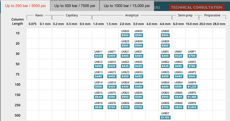
Woocommerce was an easy choice for the shopping cart, as it could handle the complex product requirements and would be easy for the client to use down the road. We built a selection grid and linked it to the product database where you can pick out the specific size of product you want to buy. There are even tabs for higher pressure applications that feature addition SKUs.
Back End Design
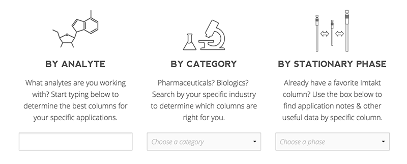
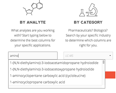
Since Imtakt works directly with scientists, the search functionality had to be top notch. We exported their existing database, then rebuilt it to modernize the structure and speed it up. The results are pretty cool. The first box is an autocomplete text box of over 1000 compounds. The second box is a category list. And the third box is product line specific.
These can be used stand alone, or combined with each other to refine the search. It is possible to see all of the application notes for say, amino acids, but filter by the ones you can run on the column you already own. Now you can read all about “Use of the Intrada Amino Acid column along with tandem mass spectrometry allows for separation and detection of all 20 standard amino acids in under 20 minutes.”
Even if you don’t want to read any of the papers, you should still swing by and check out Imtakt USA!
Imagine I invite you to my house, we barely know each other. You come over, ring the doorbell, and I open the door. Standing just beyond the swing of the door, is my wife, children, dog, neighborhood cat, and a pile of stuff that you can’t readily identify. I say “hey, come on in”, and you take 1 step into the house, being unable to go farther because everyone is blocking the way.
Now that you’ve “come in” I start introducing you to everyone and everything, telling you fluffy’s life story, and how bobby the neighbor boy just broke his arm at the local playground. At this point, you might be feeling a little bit awkward, and saying to yourself “why am I here”, and “when can I leave”.
Does that sound like a fun experience? Then why would you want to treat guests to your homepage the same way? A good homepage is welcoming, clearly identifies why they’ve come, and invites them in to explore.
An ugly, cluttered, confusing home page will cause users to flee, reflected in a high bounce rate. The best way to reduce your bounce rate is to implement a clean and clear design that speaks to your target audience and makes it easy for them to find what they want.


 Now that you’ve “come in” I start introducing you to everyone and everything, telling you fluffy’s life story, and how bobby the neighbor boy just broke his arm at the local playground. At this point, you might be feeling a little bit awkward, and saying to yourself “why am I here”, and “when can I leave”.